Devlog 3: The First Level
The First Level
We have made a lot of progress since the last devlog, including running a testing session with the rest of our class. A near-complete version of level one was the testing ground for gameplay mechanics, atmosphere and overall game direction.
Level Design
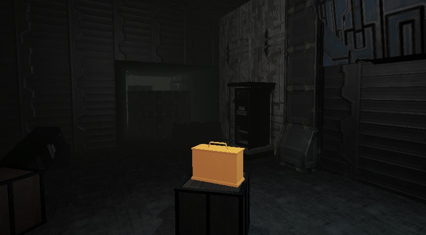
The level appearance has gone from a plain prototype to full-blown sci-fi horror. We've made use of a set of free sci-fi textures to maintain the same aesthetic throughout the game.
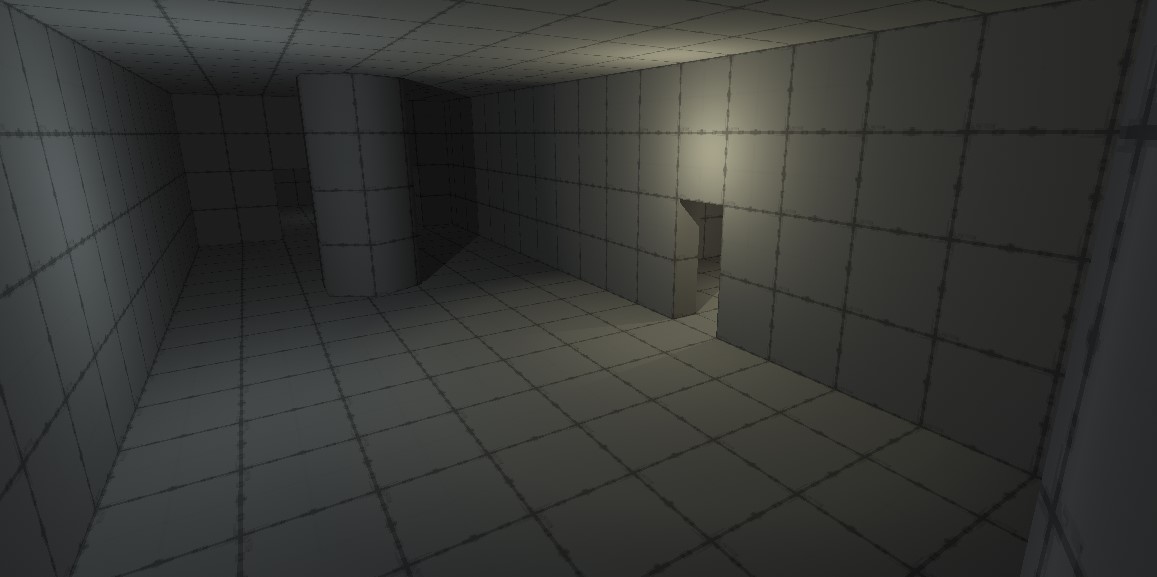
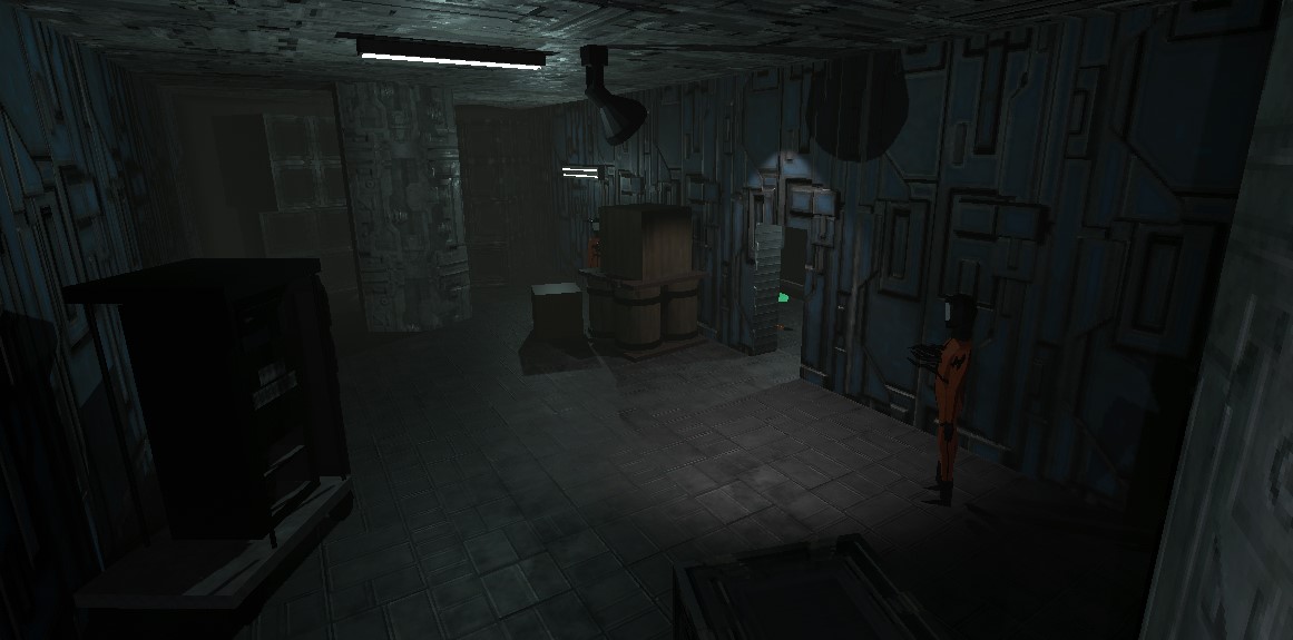
There were 4 main components in getting level 1 ready for the testing session.
- Level layout, texturing and lighting
- Prop texturing and placement
- Enemy placement
- Placement of interactable objects (ammo and health pickups, alongside the keycard to open the exit gate)
Tutorial text was also necessary to inform the player of the controls.
Our initial design for level one was a somewhat non-linear layout that gave the player two different routes to take to reach the keycard (*1) that opens the exit (*2).
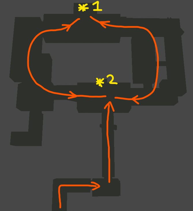
However during testing, an issue arose where players wouldn't understand the objective or whether there even was an objective to follow yet. The circular layout of the main part of the level added to the problem as players would get lost or go in circles. There was nothing to suggest the keycard room was important, and there was no purpose to the other rooms beyond finding ammo.
To fix this, the level has been converted to a linear A to B design (by blocking certain pathways shown in green below), and the keycard+door concept scrapped. There should now be no confusion on which way to go.
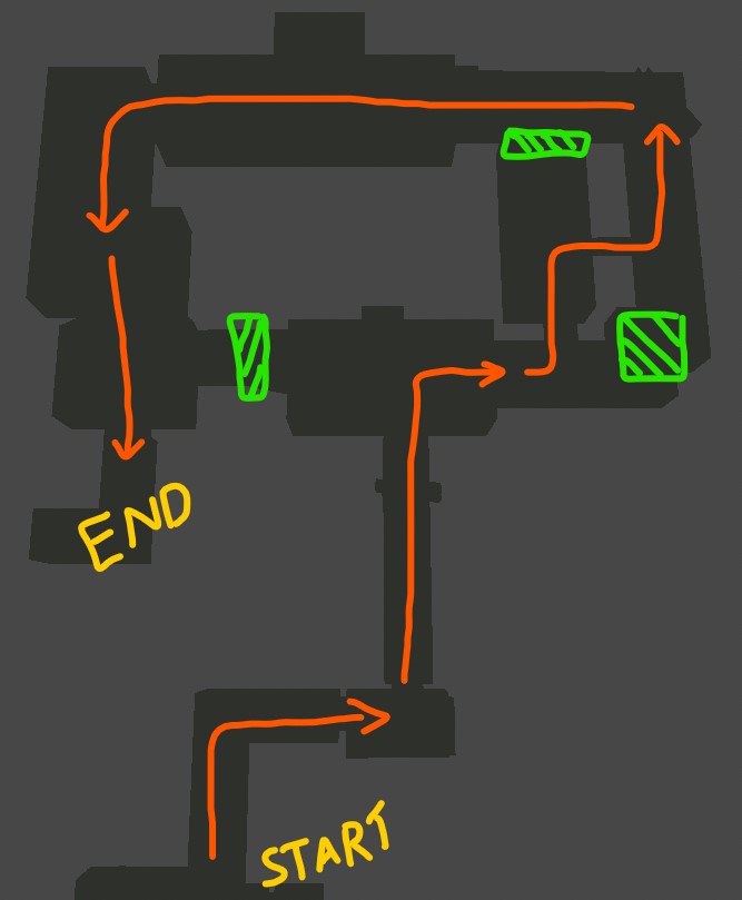
Big crates and barrels act as blockades to funnel the player through a specific path as seen below.

This was my (Fin's) first time making a 3D level for a game, and a big lesson I've learned is that while the level shape appears clear to me as the designer, the player never gets to see the top down view pictured above (unless they have a map), meaning you need to avoid needless complexity and try to view the level from the same perspective as the player as often as possible.
Player Design
The player's gun has full functionality now complete with bullet effects and sounds. Each ammo type makes a different sound to change the feel of firing each one. The HUD keeps track of how much ammo the player has.
Enemy Design
Visuals for the enemy have also been completed, though there's a few tweaks to make after testing. There are multiple animations depending on the enemy's current action, and they are best shown through a video:
Feedback from the test session indicated that enemy difficulty is slightly too easy, and they stick out from their environment too much to be scary or threatening.
Incrementum
University Group Project
| Status | Released |
| Authors | Flynn Delta, TasteDee, OKVirtue, Gonburden |
| Genre | Shooter |
| Tags | FPS, PSX (PlayStation), Short, Survival Horror |
More posts
- Devlog 6: The Official LaunchOct 18, 2023
- Devlog 5: Final Boss LevelOct 13, 2023
- Devlog 4: The Second LevelOct 13, 2023
- Devlog 2: Gameplay basicsSep 21, 2023
- Devlog 1: FoundationsSep 11, 2023

Leave a comment
Log in with itch.io to leave a comment.